Note to readers: This post is too long to be fully displayed in many email programs. (I’ve got lots of images this week.) To see the whole post, please click through to the version on the web.
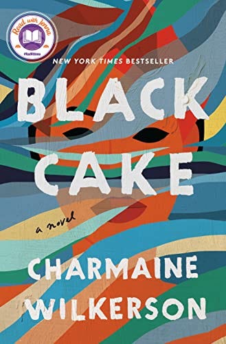
My Chicago Tribune column this week is about the rise of the “blob” style of book covers. Writing at Print, R.E. Hawley describes the blob:
It’s a canvas filled with amorphous daubs of warm, bright color, intersecting with one another to form different hues in the overlapping spaces. There’s no discernible pattern, but the blobs still feel intentionally placed—if you squint hard enough, a few of them may converge into the implied shape of a braid, or an eye, or the side of a woman’s face. On top of the canvas, a blocky but refined sans serif spells the title and the author’s name, while much smaller text in a handwritten script reads “a novel,” or, “a memoir,” or, perhaps, “a New York Times bestseller.”
Like so:
Black Cake was actually published after Hawley’s article, so we can see how ubiquitous this style has become. A third of the books chosen by Jenna Bush for her Read with Jenna Today Show Book Club have either straight-up blob or blob-influenced covers.
It’s not that these covers are bad - they aren’t - so much as it’s disheartening at how these sorts of trends take what are diverse and varied stories and flatten them to a product that’s for a demographic, book clubs consisting of primarily, if not exclusively white women.
Given that this is the demographic that buys the majority of books, this is savvy marketing, I suppose, but along with some of the themes I’ve been exploring over the last few months, I think one of the mistakes publishing makes in general is to default to selling to the audience they think already exists, rather than also trying to expand the audience for books. Shoving a bunch of books into the women’s book club box is not a great strategy for that.
(See previously: Originality Is Undervalued.)
You’re supposedly not supposed to judge a book by its cover, but the opposite is exactly what this design trend is hoping for.
Of course we do judge books by their covers, or at least I do.
Do you?
When I was younger just starting out at this writing thing, I used to indulge in a few delusional fantasies about really awesome things that could happen to me if I became successful.
(None of these have happened, but hope springs eternal.)
A review in the New York Times was up there. Sometimes while walking the dog, I’d imagine how I might respond to Terry Gross saying “Welcome to Fresh Air.”1 This one is for super book nerds, but I also sometimes fantasized about how Michael Silverblatt, host of KCRW’s Bookworm show would describe my book back to me.
(The way he breaks down the structure of Infinite Jest to David Foster Wallace in real-time, and to hear Wallace’s clear marvel at the insight is something else. Silverblatt drops these bombs on everyone he interviews.)
Above everything else was reaching a level where my book’s cover was designed by Chip Kidd.
Kidd is an art director and book designer for Penguin Random House imprint, Knopf, and his portfolio of work is quite simply amazing, having designed covers for Donna Tartt, Haruki Murakami, John Updike, David Sedaris, and many many others.
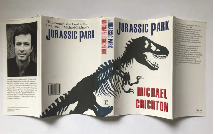
His most famous cover is for Michael Crichton’s Jurassic Park, which created a truly iconic image.
The process of conceiving, designing, and refining the cover is fascinatingly told at the Spark & Fire podcast, and gives some insight into how a designer solves the problem of creating a visual representation that captures the story and mood of a book in a way that excites an audience.
I’ve always been interested by how creative people in arenas in which I have no knowledge, experience, or talent go about their work, and seeing a master like Kidd unpack his process is absolutely fascinating.
As Keith Hayes, another amazing book designer, tells Mental Floss, the goal is not to convey what the book is about, but to capture the tone.
It’s a mix of inspiration, trial and error, and of course working inside the logistical constraints of the book jacket format. One would think that over the course of a long career a designer would run out of things to say, visually, but a Chip Kidd cover is truly a custom job.
Take for example Kidd’s cover for my friend Vendela Vida’s novel And Now You Can Go.
The imagery is drawn from events in the book, a novel about a young woman who becomes unmoored after going through a strange traumatic event, but to a prospective reader, these images obvious mean nothing.
But the mood, the vibe, of the cover captures the book perfectly, a story of disorientation and melancholy, a search for meaning. I guess you’ll just have to read it to see that I’m telling the truth.
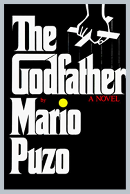
Personally, I’m a fan of the late 60s, early 70s text-forward cover design, as seen in covers for The Godfather:
And Portnoy’s Complaint:
I’m not sure why I find these compelling. Maybe the writer in me likes the large font size for the authors’ names. I get bummed out when these classic covers get redesigned for subsequent generations.
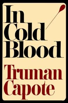
This cover for the current paperback edition of In Cold Blood evokes the Kansas plain where the books is set, but there something about the wit of the original that captures the spirit of Capote and his book more precisely for me.
Because of the level I occupy, I have not had a ton of say in the covers for my books. In pretty much every case, the publisher has sent me something saying, “What do you think?” where the choice has already been made, and I’m looking at the cover.
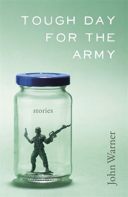
Given that reality, I feel very fortunate at the covers for my books. I think my favorite is the one for my story collection, Tough Day for the Army, which was likely done on the tightest budget of any of my books.
I feel like it really does get at the tone of the work, a mix of the silly and the serious, and I just like the color scheme as well. I did make a small suggestion that the army man figurine be tilted inside the bottle, but was told it wasn’t possible because they were working with existing stock art. Oh well. I still think that was a good idea.
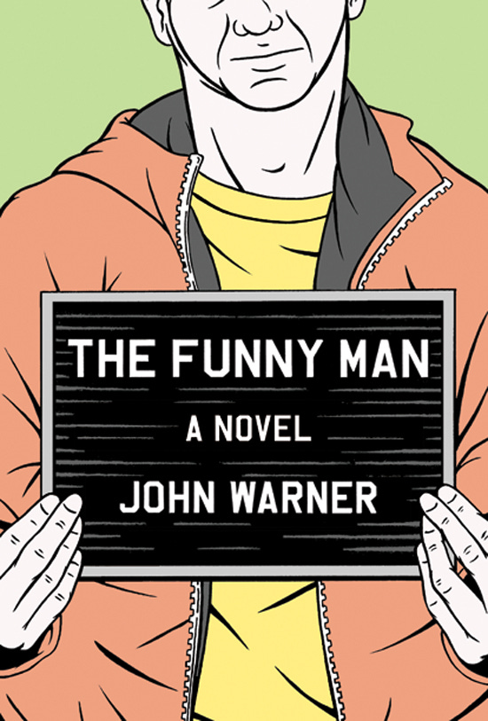
When I was sent the original cover design for my novel, The Funny Man, I showed it to Mrs. Biblioracle, and she physically recoiled - not a great sign. This is what she saw:
The obvious intent was to capture an irony between the look on the figure’s face as he’s holding up the mugshot sign, and the title of the book. This is clearly not a funny man. But seeing so much of his face did seem like a problem, cementing an image and maybe even personality of the character in the reader’s mind before even picking up the book.
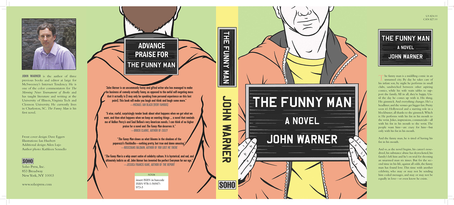
Mrs. Biblioracle suggested a small change, really just cropping the image a bit differently. The cover became this:
A seemingly subtle change that I think had huge positive effect on the cover. The publisher agreed. I ended up being really happy with the full jacket design of the book, which is a good thing because I’m confident that the packaging was not the cause of the book’s failure to thrive. We left it all on the field, as they say.
Some of the “blob” covers are really quite clever and good, but it’s a shame to tie the hands of designers by boxing them into an aesthetic that’s driven by surface-level marketing concerns or worries about what will pop on social media.
For sure, we’re all creatures of habit, and falling back on the signaling that the blob sends can be a kind of comfort - if I liked that one book with the color blobs, I’ll probably like this other one - but I also think readers are eager to be shown cover work that is fresh and gives these talented designers the freedom to do their work.
What are your favorite book covers?
Links
Barbara Ehrenreich, one of the great observers and chroniclers of America has passed away at the age of 81. Ehrenreich is the author numerous books including Nickel and Dimed: On (Not) Getting by in America, and Bright-Sided: How Positive Thinking Is Undermining America. This 2020 interview with Jia Tolentino captures Ehrenreich’s quiet ferocity at telling the stories she thought deserved more light.
It’s Fall book season, which means lots of lists of what you should be reading and not enough time to read them. WaPo: 10 Noteworthy Books. PopSugar: 112 Mysteries and Thrillers That Will Keep You Hooked from Beginning to End. Vulture: 57 Books We Can’t Wait to Read This Fall. Harper’s Bazaar: The Best, Buzziest New Books of 2022.
Alexander Chee, author of Queen of the Night and How to Write and Autobiographical Novel has an exciting new book-related gift box that looks very cool.
Good news on the fight against maniacs trying to deny people access to books. A Virginia judge has basically laughed out of court an attempt to remove two books from bookstores out of court, declaring the law it was brought under blatantly unconstitutional.
The New York Times continues their interesting new series of a local author telling us how to read our way though their city. This time it’s Juan Villoro and Mexico City.
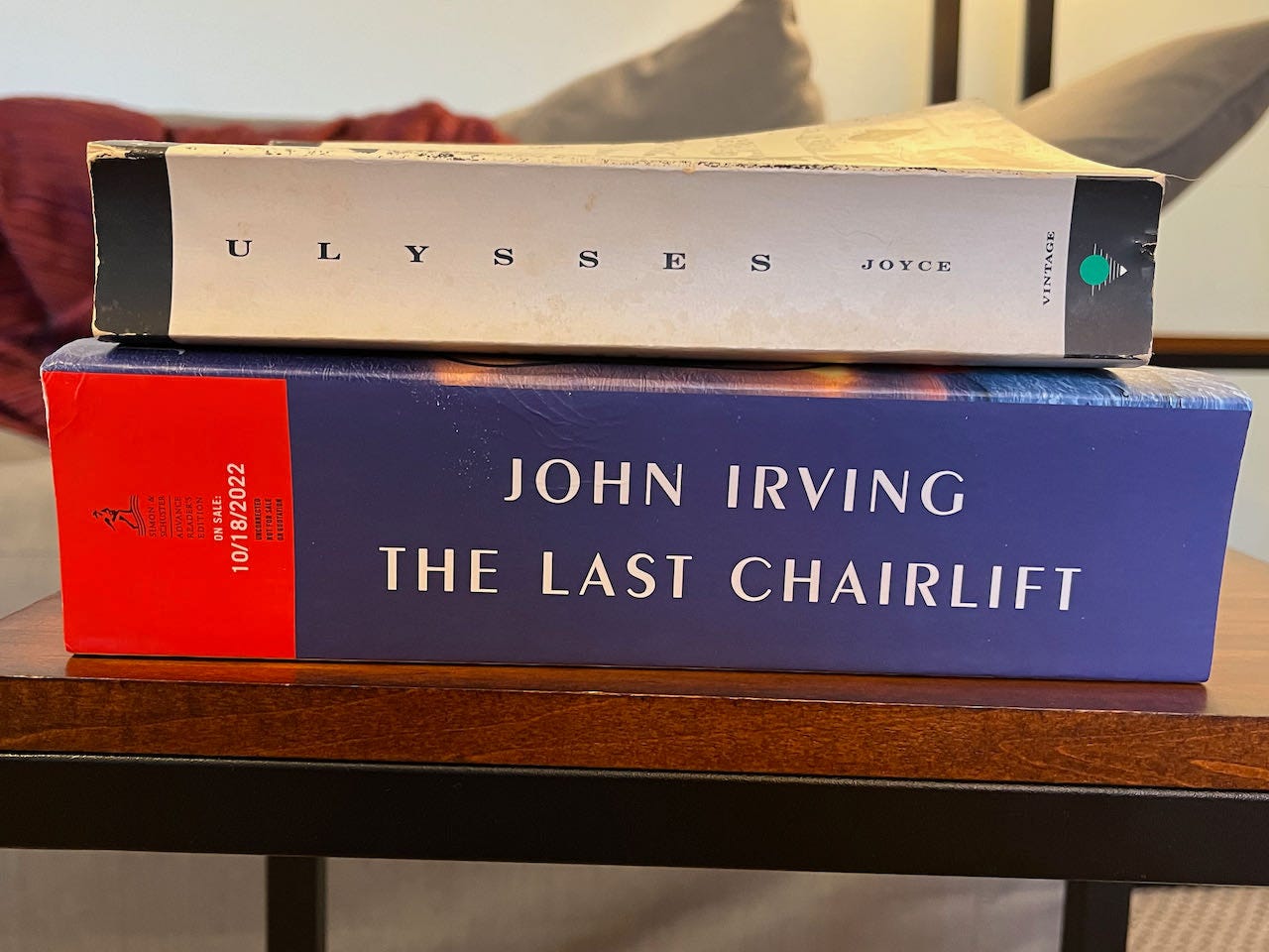
The marketing email from Simon & Schuster for John Irving’s forthcoming The Last Chairlift, called Irving’s “last long novel.” No lie about the long part (Ulysses included for scale.)
Recommendations
All books linked below and above are part of The Biblioracle Recommends bookshop at Bookshop.org. Affiliate income for purchases through the bookshop goes to Open Books in Chicago.
Affiliate income is up to $208.20 for the year, over a 10% increase from last week!2
1. The Kindly Ones (The Sandman #9) by Neil Gaiman
2. The World According to Mister Rogers by Fred Rogers
3. Warbreaker by Brandon Sanderson
4. The Year of Magical Thinking by Joan Didion
5. The Light Fantastic by Terry Pratchett
Ash M, Mountain View, CA.
For Ash I’m recommending a novel about the threat of technology that could end the world, which is from a few years back, but seems increasingly prescient. Charlie Jane Anders’ All the Birds in the Sky.
I hope everyone is having a good holiday weekend wherever you are. I’m wrapping up my reading of The Boys by Katie Hafner, which apparently has some twist that I haven’t gotten to yet.
Next up? Either Cyclorama by Adam Langer, Groundskeeping by Lee Cole, or I start climbing Mount Irving’s Last Long Novel.
One of these weeks I’ll do a proper plea for more subscribers, but for this week, a simple reminder that this writing is supported by patrons that make it possible for others to read the content for free.
Take care,
John
The Biblioracle
Which is better? A pleasure to be here? or Thanks for having me? or What up Terry?
I’ll match affiliate income up to 5% of annualized revenue for the newsletter, or $500, whichever is larger.







I pass over the blob covers (wrongly sometimes) assuming it's a fluff book. When I look around my bookshelves there isn't one in sight. In Cold Blood will never leave my mind. I like the cover on a current book I'm reading called The Actual True Story of Ahmed & Zarga. I got the feel of his trek across the desert before I even started reading.
Great article John!
Some of my favorite covers are:
HAMNET ( boy with a feather across his face )
THE LIFE OF PI ( gorgeous tiger walking from back cover across to front cover )
NICKEL BOYS ( small drawing of two boys and only one shadow )
THE ROAD ( solid black cover with the title in red )
KLARA AND THE SUN ( a stylized hand with a gold sun dot in the center )
CLOUD ATLAS ( a collection of six boxes with photos of a variety of different clouds )